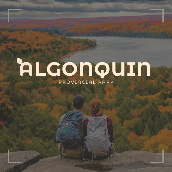
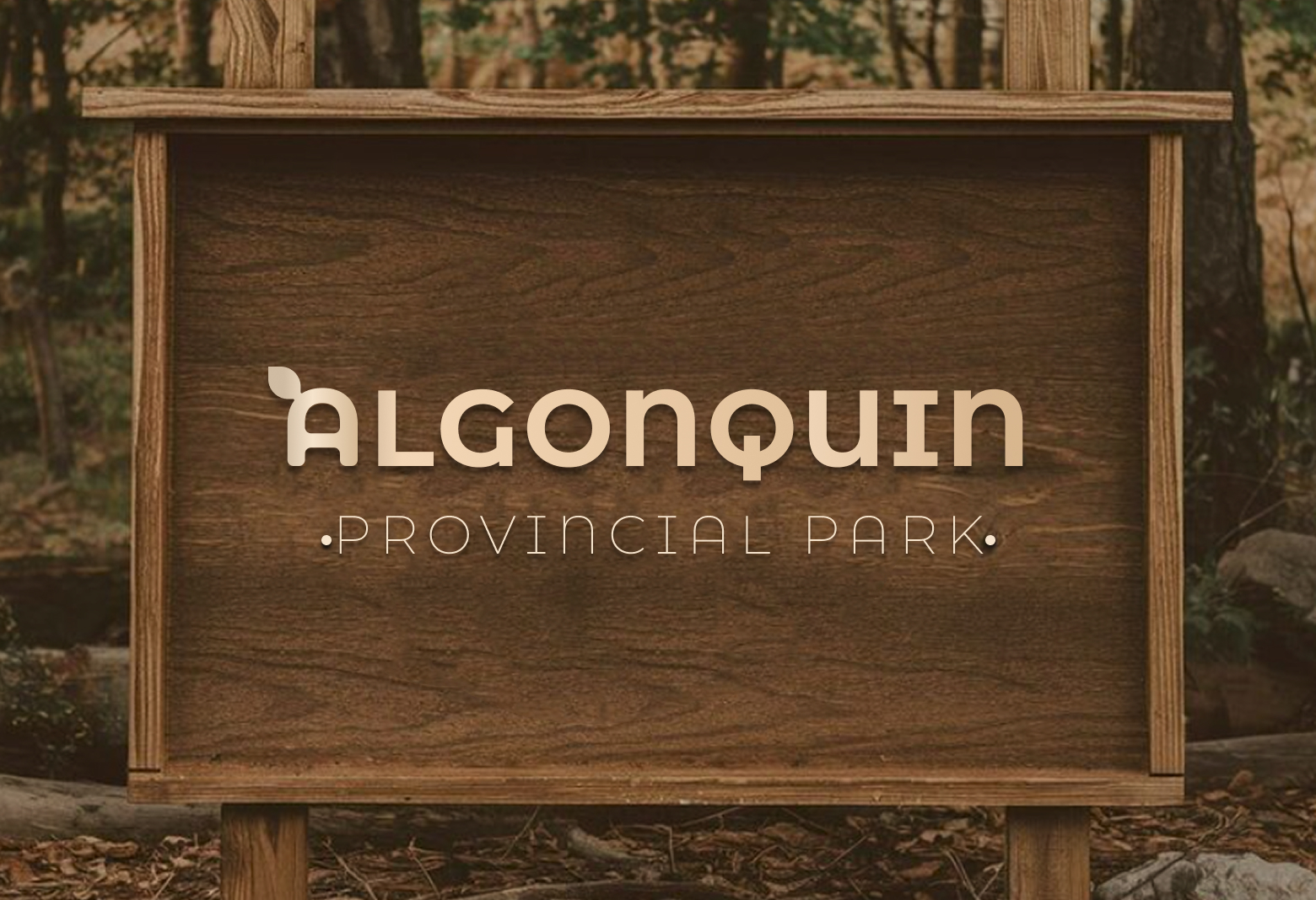
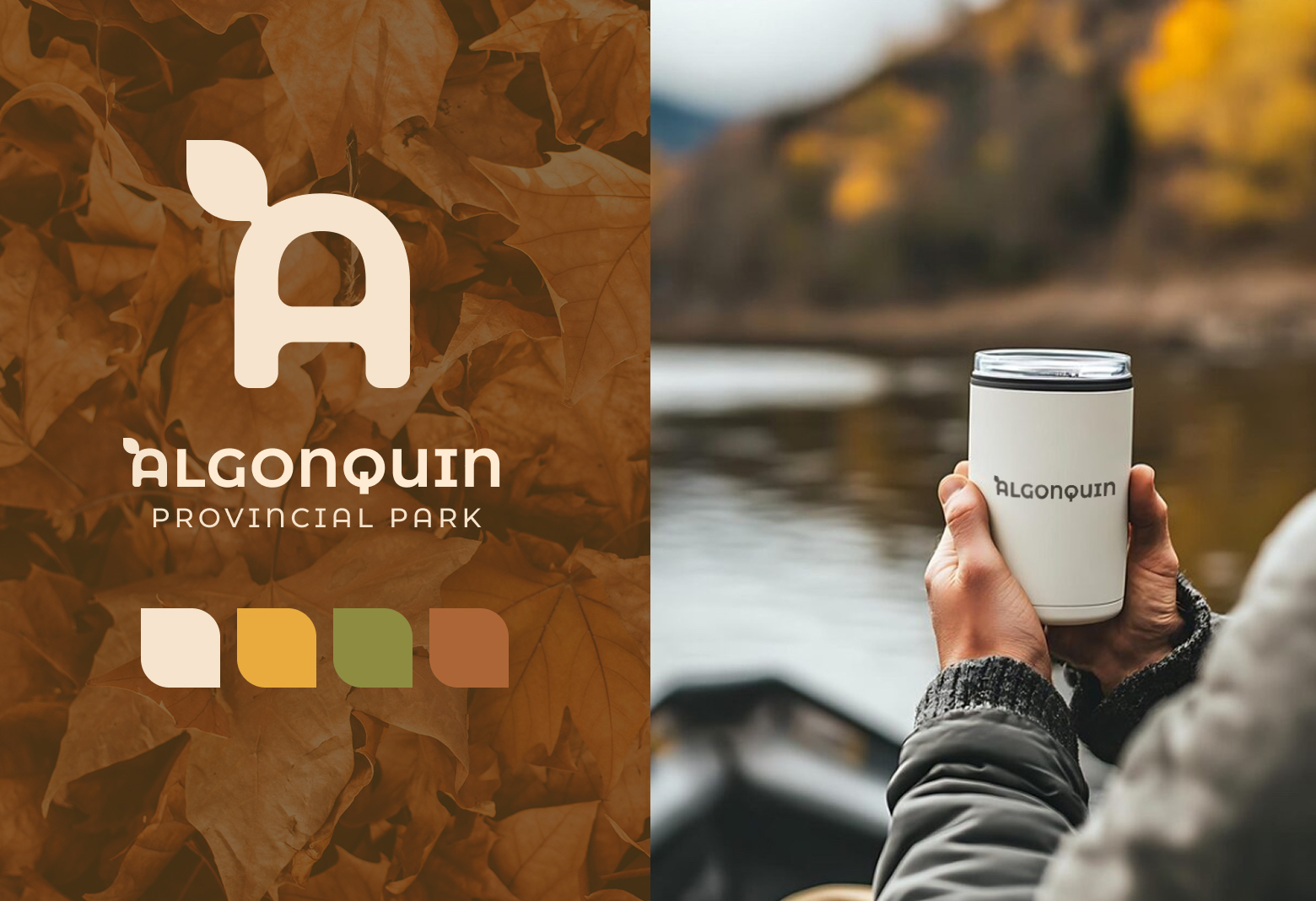
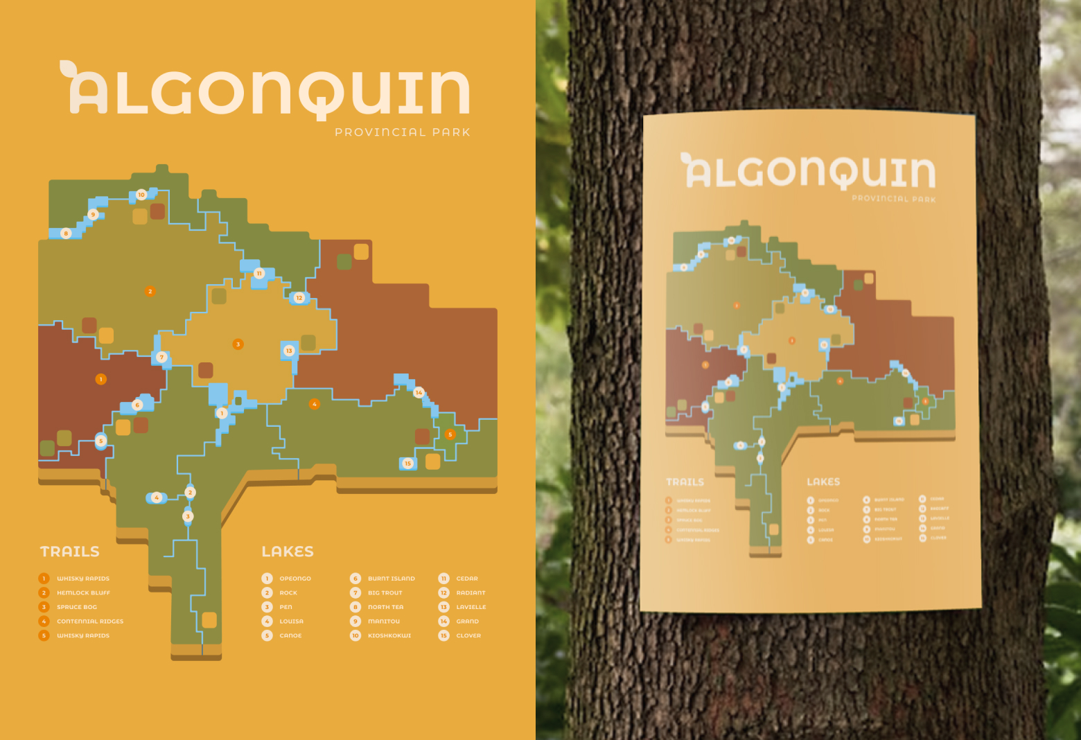
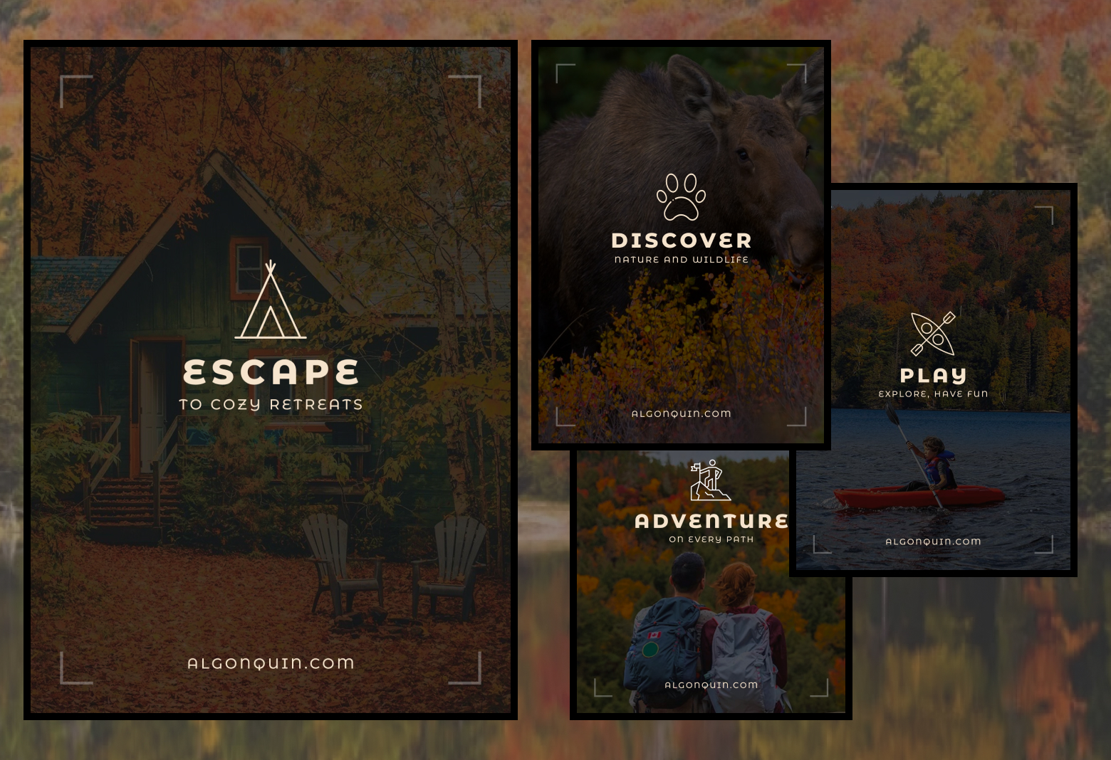
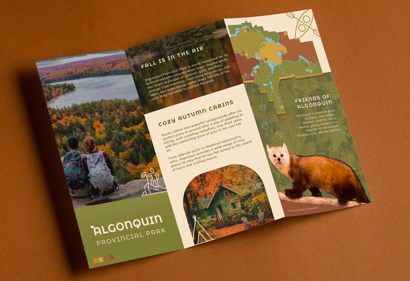
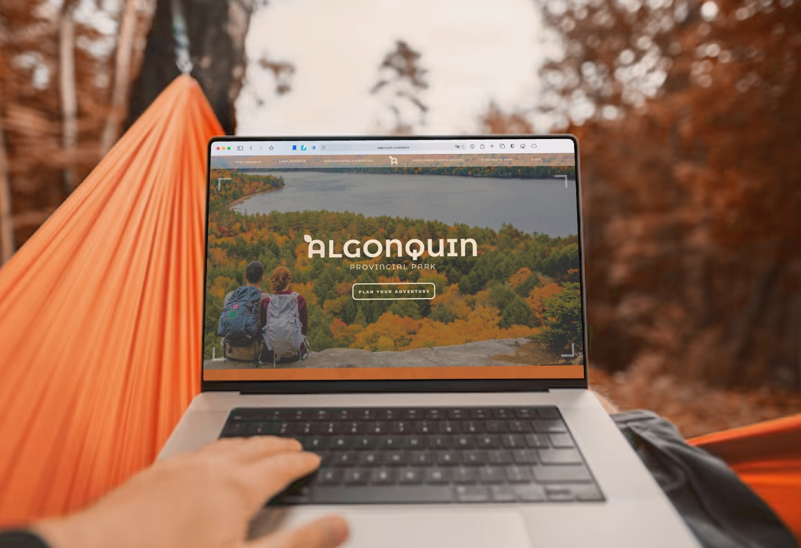
This project explores a cohesive visual identity for Algonquin Provincial Park inspired by the region’s iconic autumn landscape. The brand system includes a custom logo, an illustrated park map, a printed brochure, and a website mockup, all unified through a warm seasonal colour palette of deep reds, burnt oranges, golden yellows, and forest greens, balanced with an off-white cream tone for contrast. The goal of the project was to capture the natural beauty, calm atmosphere, and sense of adventure that define Algonquin while creating clear, accessible materials that would enhance the visitor experience across both print and digital platforms.